




The Importance of Color Profiles in Design and for Designers
Colour accuracy shapes how professional your work looks on screen and in print. If you have ever sent a perfect-looking layout to print and received something dull, oversaturated or simply wrong, colour profiles were almost certainly involved. Understanding how they work, and how they interact with your hardware, is central to the importance of color profiles in design and to a smooth production workflow.
Ginger6 builds custom PCs for designers, photographers and studios, so the team works daily with colour-managed workflows, wide-gamut monitors and calibrated devices. The sections below explain what colour profiles do, how they relate to RGB and CMYK work, and how Ginger6 systems support reliable colour from the first concept to the final export.
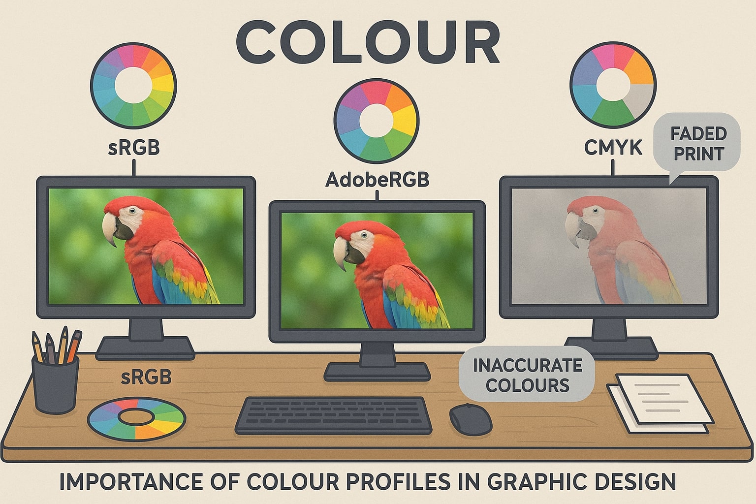
What Colour Profiles Are and Why They Matter
A colour profile is a description of how a device or file handles colour. It tells your software which colours are available, how they are stored and how they should be translated between different devices in your workflow.
In day-to-day design work you will usually deal with three broad types of profile. Input profiles describe how devices such as cameras and scanners capture colour. Document profiles sit inside the files you edit and define how colour values in that document should be interpreted. Output profiles are used by monitors, printers and presses so they can reproduce those colours as accurately as their hardware allows.
Without suitable profiles in place, the same image can look different on every screen and then shift again when it reaches print. With sensible colour management, your software interprets colour numbers correctly, moves them between devices in a controlled way and keeps hues within each device’s capabilities rather than letting them drift.
For graphic designers, that brings several benefits. Brand colours remain consistent across social media, websites, printed materials and signage. Photographs appear natural and balanced on calibrated displays and proofing devices. You also spend less time fixing unexpected changes after export, because colour behaviour is more predictable from the start.
Colour profiles act as a shared language for colour between all the devices involved in a project. Once you understand that language, you can work knowing that what you see in your design tools is a close match to the finished result. If colour shifts are a recurring issue in your projects, talk to Ginger6 about setting up a PC and monitor pair that handles profiles and calibration reliably.
Colour Spaces, Profiles and Common Design Scenarios
Colour spaces such as RGB, sRGB, Adobe RGB and CMYK describe the range of colours (the gamut) that a device or file can represent. Profiles sit on top of these spaces and define how specific devices behave inside them.
RGB, sRGB and Wide-Gamut Spaces
RGB colour spaces are used for screens and digital delivery:
-
sRGB is the standard space for web browsers, mobile devices and many monitors. It covers a modest but widely supported gamut, which makes it safe for general digital work.
-
Adobe RGB covers a wider gamut, particularly in greens and cyans, and suits high-end monitors and photography workflows.
-
Spaces such as DCI-P3 and ProPhoto RGB extend the gamut further and are used in cinema, grading and advanced imaging.
If you design primarily for screens, sRGB profiles usually give the best balance of predictability and reach. For projects that span professional print and digital work, Adobe RGB can help retain subtle gradients, provided your monitor and workflow support it.
CMYK for Print
Printers use inks or toner, so they work in CMYK (cyan, magenta, yellow and black) rather than RGB. A CMYK profile describes how a specific device, ink set and paper combination reproduces colour.
When you convert from RGB to CMYK, some colours cannot be reproduced exactly. A good output profile maps those out-of-gamut values carefully and keeps colour relationships as natural as possible.
Matching Spaces to Your Projects
A simple approach is:
-
Web, social, on-screen graphics: work in sRGB and keep that profile embedded.
-
Mixed digital and high-quality print: work in Adobe RGB, soft proof in CMYK and convert with the correct press profile before export.
-
Print-only projects: design in an RGB space that suits your monitor, then convert to the printer’s CMYK profile close to delivery.
Embedding the chosen document profile in your files signals to clients, collaborators and printers how colour should be interpreted, which supports better colour matching throughout the workflow.
How Custom PC Hardware Supports Accurate Colour Profiles
Colour management relies on hardware as much as software. Even the best colour profile will fail if a monitor cannot show the colours you specify or if the graphics subsystem mishandles profiles, so the underlying PC specification really matters.
Monitors vary widely in their native colour space. Entry-level displays typically cover most of sRGB and no more, while specialist designer and photography monitors can reach a high percentage of Adobe RGB or DCI-P3. If you work with wider gamuts, you need a panel that can genuinely display them, otherwise an Adobe RGB document profile is largely wasted because the screen simply cannot reproduce the colours you are choosing. Higher quality panels also help by reducing banding, improving brightness and colour uniformity, and keeping colour behaviour consistent as you adjust luminance for different working environments.
Your graphics card and its drivers control how colour data reaches the monitor. A reliable card outputs stable signals across all ports, applies ICC profiles consistently, and is capable of driving several calibrated displays with different profiles at the same time. Calibration hardware then measures the monitor output and creates an accurate profile for that specific display. That profile tells the system how to translate colour data so that what you see on screen is a close match to the intended colour space, rather than a rough approximation.
Ginger6 systems are assembled and stress tested with colour-sensitive work in mind. Testing includes long sessions under load, setups with multiple monitors where needed, and careful selection of GPUs and connections so that colour profiles behave as expected in real design software, not only in synthetic benchmarks. If you are planning to run two or three calibrated monitors from a single workstation, ask Ginger6 for advice on GPUs, connections and monitors that handle colour profiles correctly.
Using Colour Profile in Real Design Workflows
Knowing about profiles conceptually is useful, but most designers need clear steps they can follow in their everyday tools.
Setting Document Profiles from the Start
When you create a new file in applications such as Photoshop, Illustrator or InDesign:
-
Choose an RGB or CMYK document profile that matches your target output.
-
Ensure colour management policies are set to preserve embedded profiles when opening files.
-
Keep a close eye on warning messages when you import artwork with different profiles.
Starting in the right space avoids last-minute surprises when exporting or printing.
Managing Input Profiles
Assets arrive from many sources: cameras, stock libraries, scanners and other designers. Correct input profiles tell your software how to interpret those colours.
-
Shoot photographs in a known colour space such as sRGB or Adobe RGB.
-
Make sure camera or scanner profiles are recognised and embedded.
-
Avoid stripping profiles when saving images for design projects.
Handled correctly, these profiles preserve colour intent from capture through to layout.
Preparing Files for Print
For print projects:
-
Work in an appropriate RGB space while designing.
-
Use soft proofing with the printer’s CMYK profile to preview likely changes.
-
Adjust images and colours while you can still see them in RGB.
-
Convert to the printer’s CMYK output profile at export, keeping that profile embedded in the PDF.
Close cooperation with your print provider helps here. Many supply tailored profiles for their press and stock combinations, which can significantly improve colour reproduction and colour consistency.
Colour Match: Keeping Colours Consistent across Devices
To achieve a reliable colour match across devices:
-
Calibrate each monitor regularly and apply its ICC profile.
-
Use the same working spaces in your design applications on all machines.
-
Avoid unmanaged viewing environments such as uncalibrated web browsers when judging subtle differences.
If you must check work on phones or tablets, treat those screens as rough references rather than final colour standards.
Need help setting colour policies, profiles and soft proofing in Adobe apps on a new PC? Ginger6 can preconfigure systems for colour-managed design before they leave the workshop.
Working with Ginger6 on Colour-Accurate PCs
Colour profiles are most effective when backed by hardware and support that respect their role in your workflow. That is where a specialist builder such as Ginger6 comes in.
When you contact Ginger6, the team will ask about your main design tools and preferred colour spaces, whether your work focuses on web, print or a mix of both, the number and type of monitors you plan to run, and how colour-sensitive your projects are, from branding and packaging through to photography and video.
Using that information, they recommend processors, RAM, graphics cardsand storage layouts that support smooth work with large colour-profiled files, together with monitors that suit your colour needs and budget.
Tested Hardware and Long-Term Support
Every Ginger6 system is assembled by hand and stress tested for at least 24 hours, which includes pushing GPU outputs, storage and memory under heavy load. This approach uncovers potential issues before you install software and start colour profiling your displays.
Lifetime UK support means you can ask for help when:
-
Moving to new colour spaces in updated design tools.
-
Adding extra calibrated monitors to an existing workstation.
-
Upgrading graphics cards, RAM or storage to handle larger colour-managed projects.
With the right mix of colour profiles, reliable hardware and sensible workflow habits, your designs look consistent on screen and in print, and you spend far fewer hours chasing missed matches or unexpected shifts.
Ready to build a colour-accurate design workstation around your preferred profiles and tools? Contact Ginger6 with details of your current setup and colour workflow, and the team will recommend a custom PC configuration that keeps your colours consistent from concept to delivery.